The Week Wind Broke the Records
May the 4th was Star Wars day, and since that day, we have certainly felt the Force in the atmosphere above Australia – several wind energy records were broken. This was a combination of a low-pressure system across south eastern Australia, seasonally high wind speeds and the recent construction of several large new wind farms.
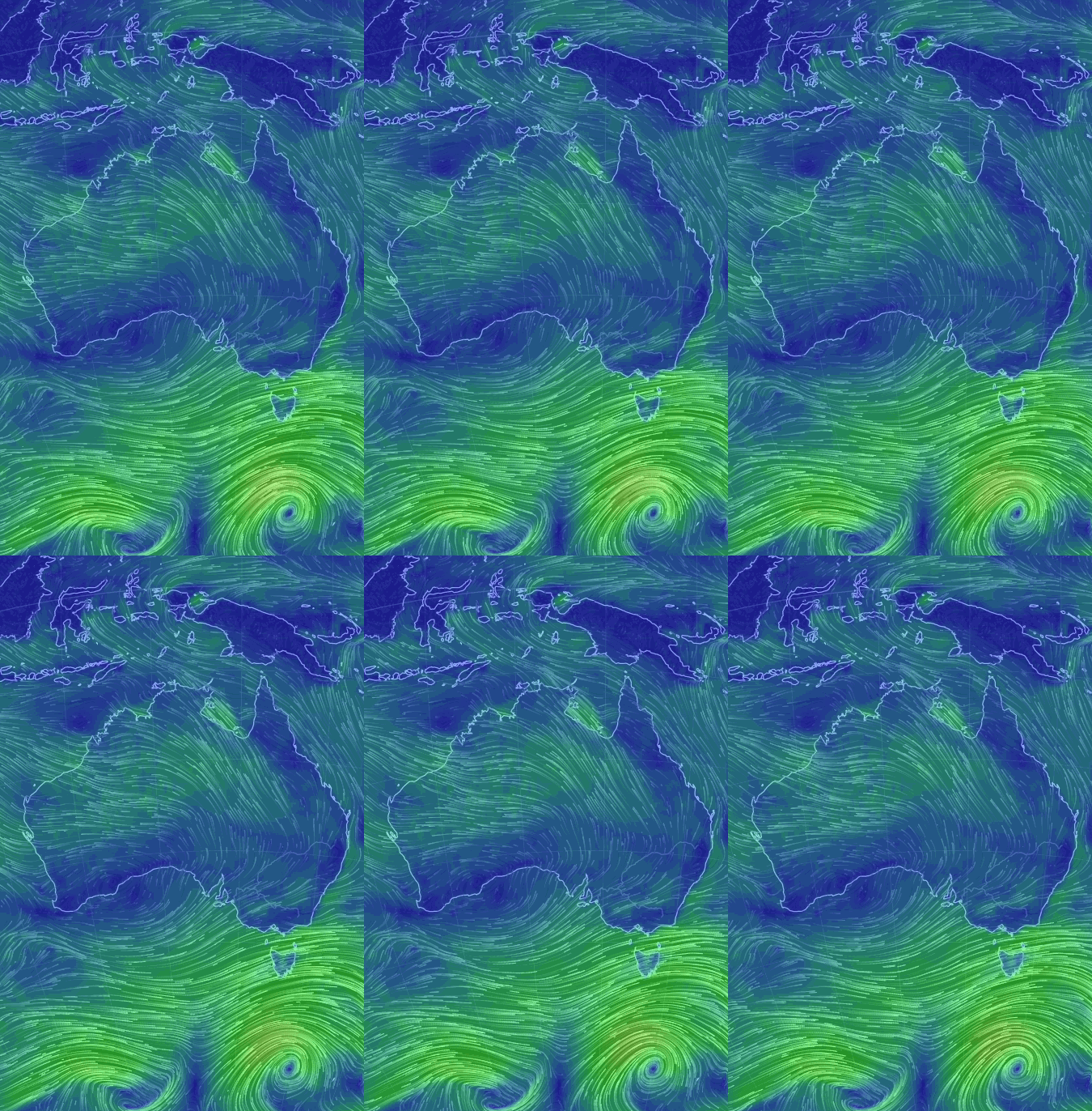
Most of these new wind farms were built back when investment in renewable energy was strong, due to bipartisan support for the Renewable Energy Target scheme – something we have lost in the past year, due to uncertainty around the RET.
Note: the data in this post refer specifically to the National Electricity Market (NEM) – the connected electricity network of Queensland, New South Wales, Victoria, Tasmania and South Australia (Western Australian and the Northern Territory are on different markets).
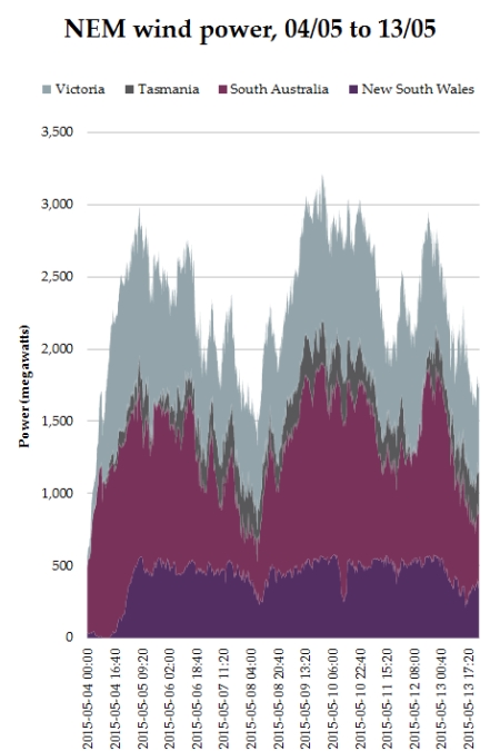
At 00:00 on the 11th of May, wind power output hit 3,218 megawatts (measured every five minutes).
The gif below is also from Earth.nullschool.net – it shows wind power density at 01:00 on 11/05/2015 – close to when wind peaked at its maximum.
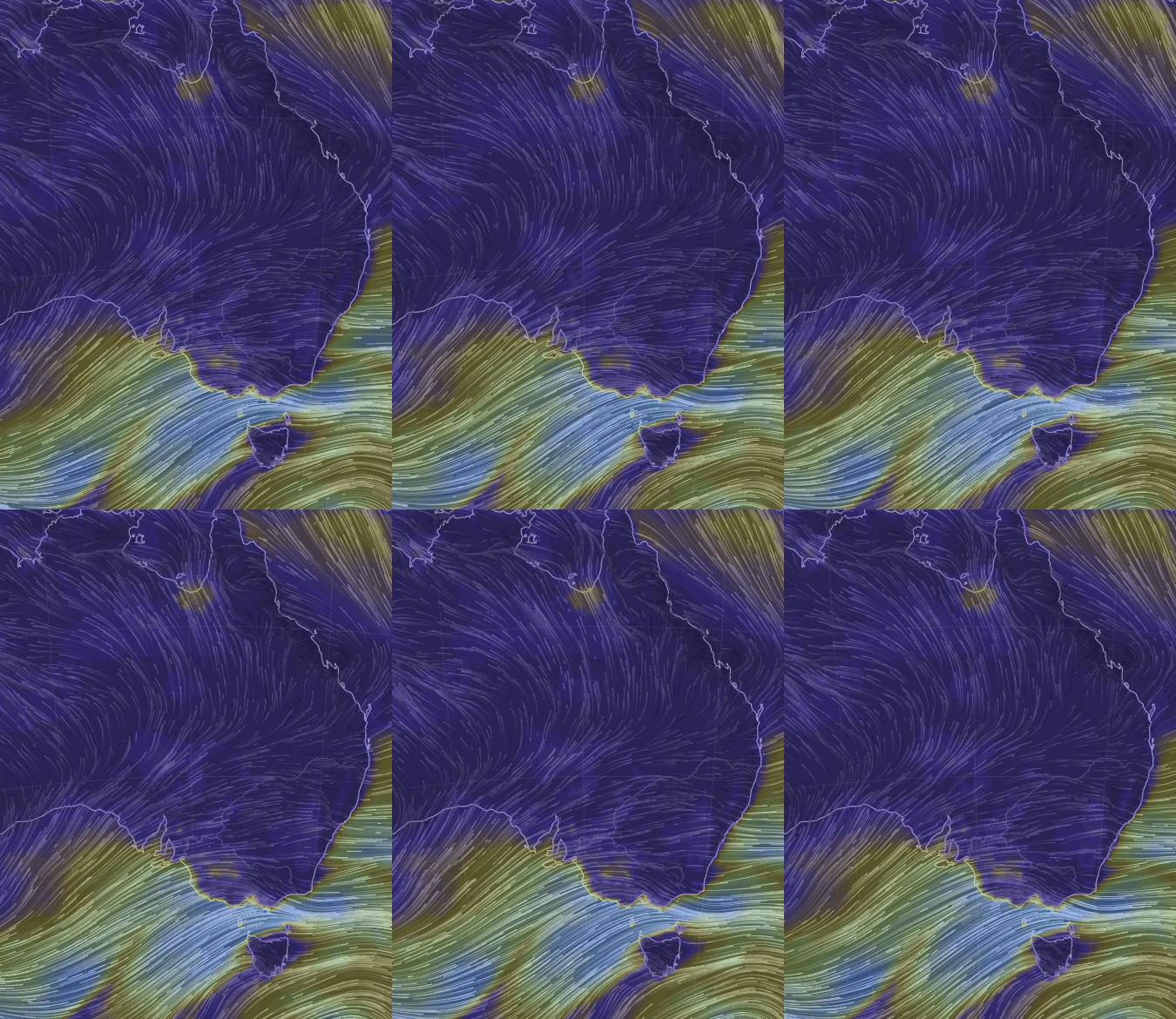
This is the highest-ever NEM wind farm output according to records. Wind power was generating more than 3,000 megawatts for 450 minutes last week – the winds have not decreased, though they are due to calm over the course of this week. The chart below shows wind power over the week, and a few days this week too:
Wind speeds this high don’t occur every week, but it demonstrates:
– Why wind turbines are built with a very high capacity – to capture these moments of high winds when they occur.
– The real world impacts of the RET – new wind farms converting more atmospheric kinetic energy to electricity, which is used instantaneously in Australian households (at its highest level, 3,218 megawatts, wind was supplying the equivalent electricity consumption of 4,336,874 households assuming yearly consumption of 6.5 MWh)
The entire week clocked up the most energy output from wind farms in the history of Australian NEM wind power. The chart below shows year and week number (1 to 52) from 2010 to mid-May 2015, for the NEM:
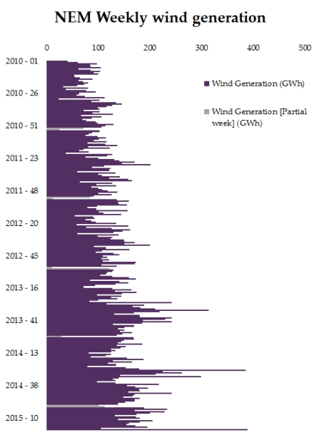
Note – dips occur in the first week of each year as these are partial weeks split by the year change
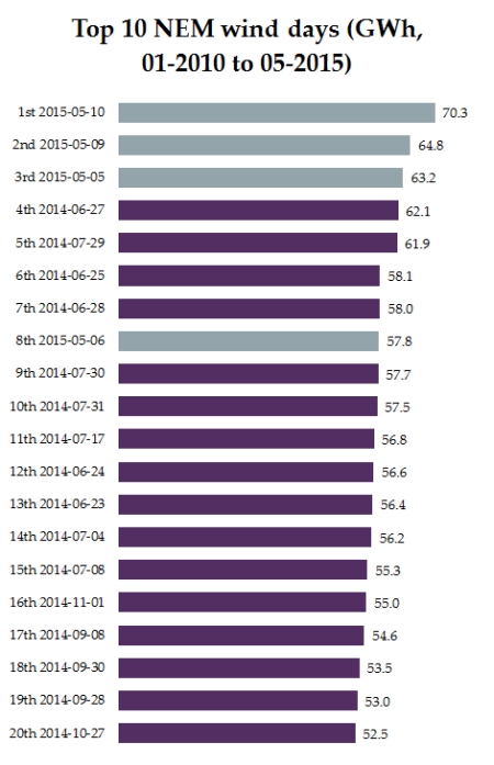
If we look at the top ten wind days on the NEM from 2010 to May 2015, we can see last week takes the top three spots:
Here’s a chart showing last week and the data for Monday to Wednesday this week (up until the 13th), including other fuel types on the NEM, for comparison:
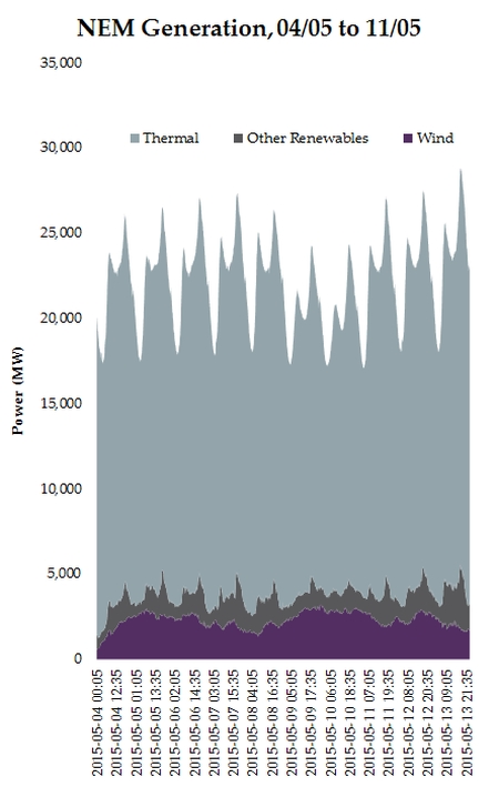
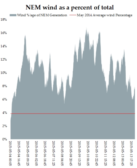
“Other renewables” are large-scale solar, biomass and hydro and “Thermal” is black coal, brown coal, gas and liquid fuel. Some people have asked about wind power as a percentage of total generation – here’s the same data but with wind as a percentage of all other output.
If you would like to access the raw wind power data for 2010 to May 2015, aggregated by state, click here. These data are sourced from a third party, so please check for accuracy with the market operator if you intend to use these figures for analysis.